Dimensions
In our paper, we propose thirteen style traits frequently used in the design of letters and logos in Heavy Metal and its Extreme Metal subgenres, three of which only apply to the graphical elements that adorn these logos – that is if there are any at all. Together with five relevant characteristics taken from Bertin, this enables us to describe the broad superset of Metal logos and differentiate between the genres and subgenres that they represent.
In the following, we work through each dimension in turn. To help illustrate the set of dimensions more completely than in the paper, we add representative examples of actual bands that are (or were) out there.
To learn more about how these dimensions relate to metal genres, please refer to the Samples page, where you will find further examples detailing a broad range of genres and subgenres in terms of music and their peculiar design aesthetics.
Now, without further ado, here is your in-depth guide to the Dimensions of Doom and beyond!
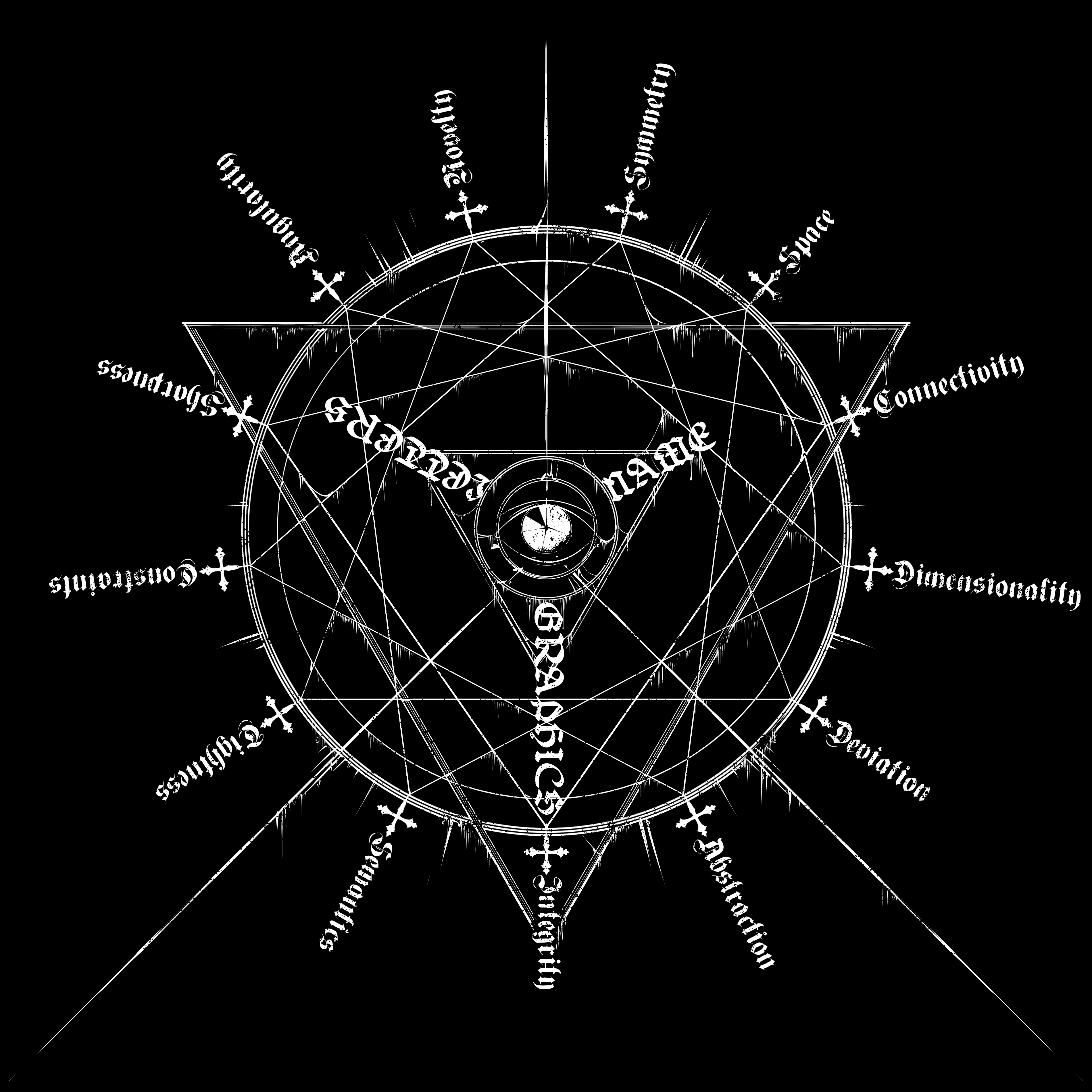
Bertin-Inspired
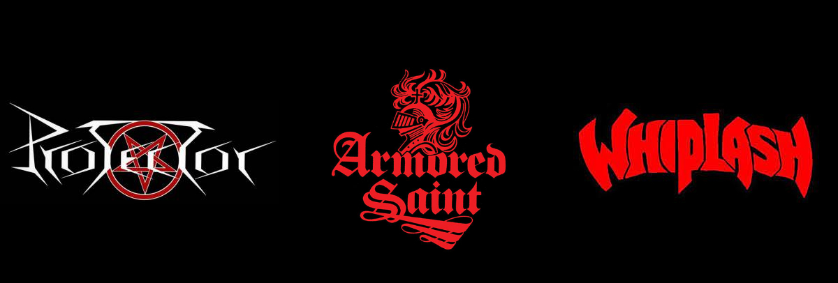
THICKNESS
How thick are the letters?
Low: very thin (Protector); medium: “average” (Armored Saint); high: very thick (Whiplash).
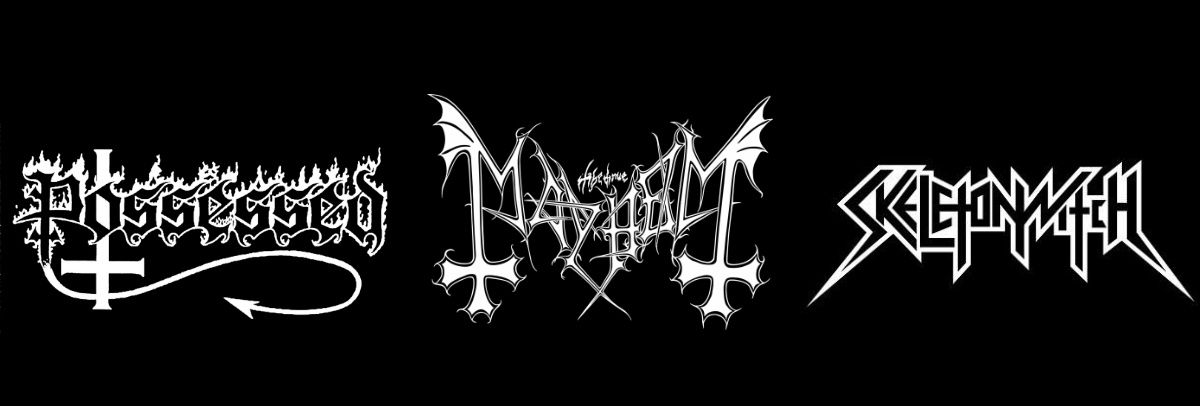
SIZE
How much variation is there in letter size in terms of height and/or width?
Low: little to none (Possessed); medium: only the first and last letters deviate (Mayhem); high: a lot (Skeletonwitch).
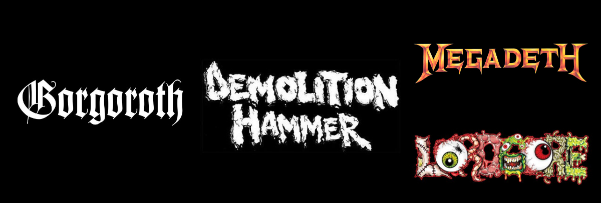
TEXTURE
How much texture is there in the letter rendering?
Low: textureless (Gorgoroth); medium: it has a hint of texture (Demolition Hammer); high: texture rich: either the letters are painted or airbrushed (whether digitally or on paper) to look like some material (Megadeth) or they are (almost) like drawings in themselves (Lord Gore).
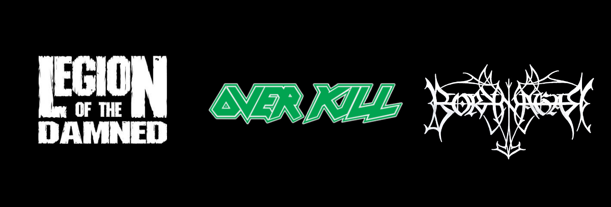
ORIENTATION
How much variation is there from standard vertical letter orientation?
Low: the letters are upright, i.e. the straight lines are straight (Legion of the Damned); medium: (some of) the letters are at an angle (Overkill); high: (some of) the letters are flipped or mirrored (Borknagar).
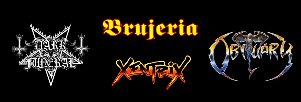
COLOR
How many colors (hues, no matter their values or saturation) does the letters have in terms of color range?
Low: monochrome: black-and-white or single-color (Dark Funeral); medium: (a gradient of) two or three colors (Brujeria, Xentrix); high: full-color (or features a wide range range of hues, values, and saturations) (Obituary).
The Dimensions of Doom
Letters
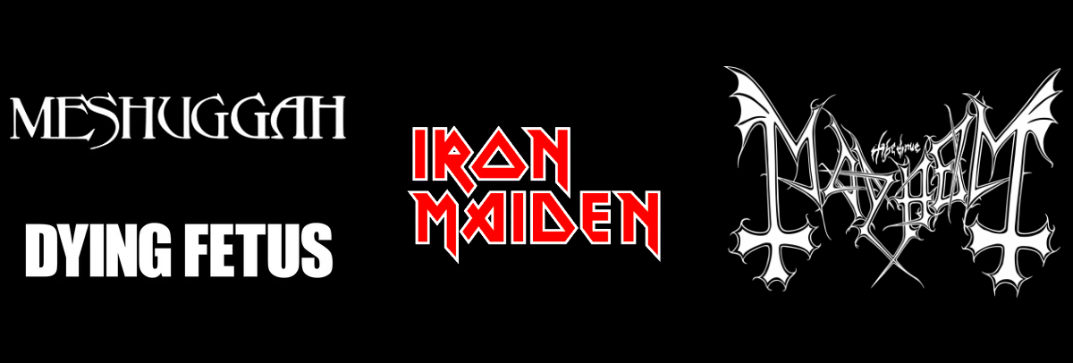
NOVELTY
How original are the letters and text elements used in the letters of the logo?
Low: it is a wordmark (i.e. type-only) logo (Meshuggah, Dying Fetus); medium: it is a wordmark with custom elements (Iron Maiden); high: it is custom, hand-drawn logo (Mayhem).
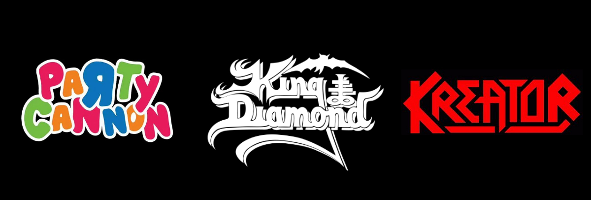
ANGULARITY
How angular are the outlines of a letter?
Low: all round and soft (Party Cannon); medium: a contrasting mix of round and sharp outlines (King Diamond); high: all hard and sharp (Kreator).
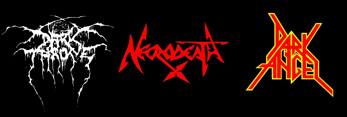
CONSTRAINTS
How fixed are the angles of the letter segments?
Low: loosely drawn, with much variation in the angles (Darkthrone); medium: tightly drawn, with with some hard angles but with a loose finish (Necrodeath); high: all drawn with (mostly) fixed and hard angles (likely with a set square and protractor) (Dark Angel).
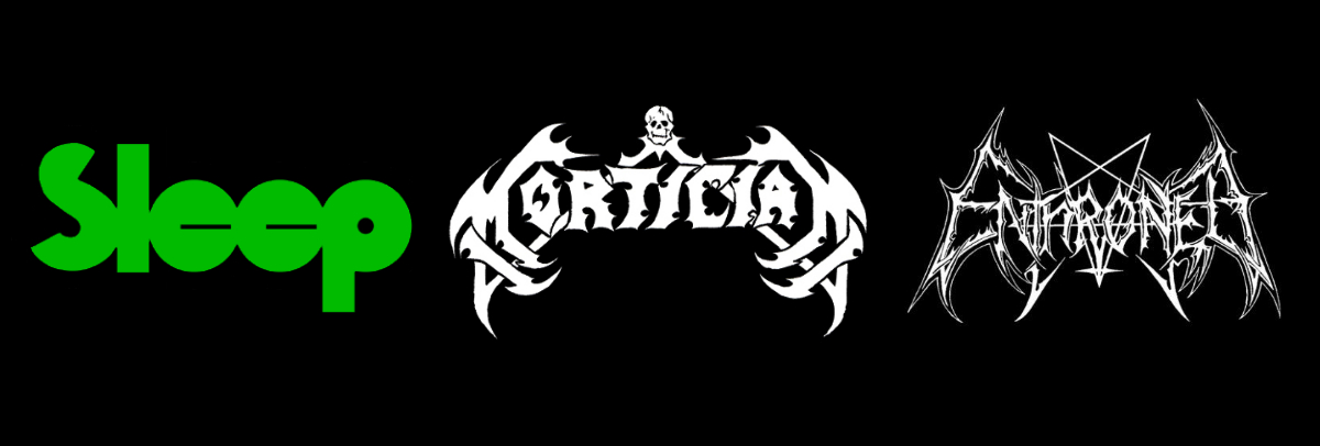
SHARPNESS
How many prickly and sharp elements do the letters have (think here of “shark teeth”, zigzags, needles, “hotrod flames”)? In other words, would it hurt if you were to touch them?
Low: none (Sleep); medium: a few (Mortician); high: a lot (Enthroned).
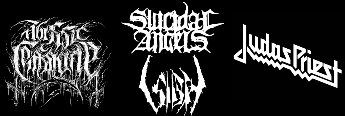
TIGHTNESS
How tight (clean, precise) are the letters?
Low: rough (sketchy, or as if someone went over with some dirt, splattering effect) (Abyssic Commune); medium: rustic but not sketchy (Sigh, Suicidal Angels); high: tight and clean (Judas Priest).
Band Name
SYMMETRY
To what degree does the band name have vertical axis symmetry (i.e., it can be mirrored from left to right)?
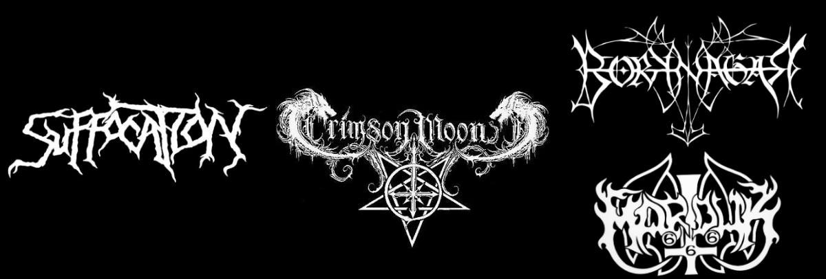
Low: no symmetry (Suffocation); medium: only the outermost left and right parts of the logo are symmetrical: these could either be the first and last letters (Ensiferum) or a letter and a “gimmick” (i.e. some sort of additional graphic) (Crimson Moon); high: a high level of symmetry throughout the whole logo: either organically (Marduk) or forcefully (e.g. by flipping letters horizontally) (Borknagar).
SPACE
How much negative space is left between the letters?
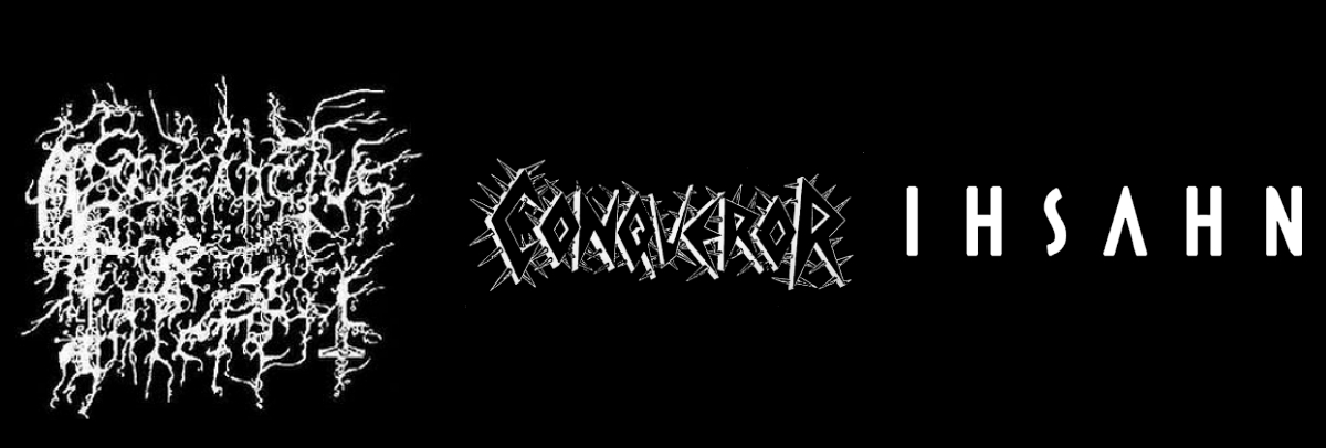
Low: little (Prosanctus Inferi); medium: partly filled (Conqueror); high: a lot (Ihsahn).
CONNECTIVITY
How connected are the letters in the wordmark (i.e. the letters and words that are part of the logo)?
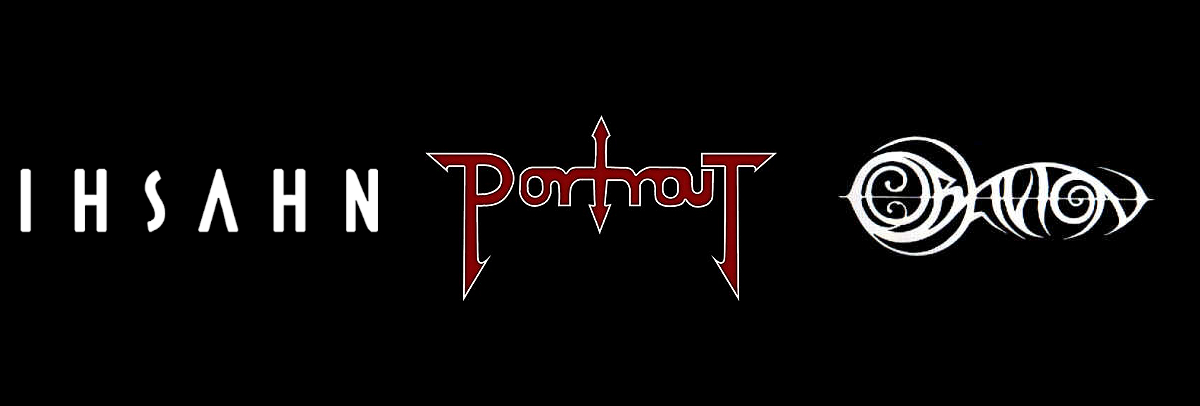
Low: the letters are separate from each other (Ihsahn); medium: some of the letters are connected (Portrait); high: the letters are fully connected to each other (Oblivion).
DIMENSIONALITY
How 3D does the logo look?
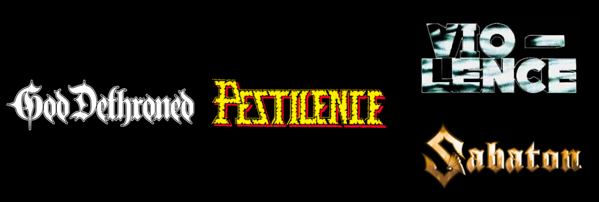
Low: it looks flat (God Dethroned); medium: it has a hint of depth to it (Pestilence); high: it is fully rendered in 3D: it can either be a three-dimensional drawing in perspective (Vio-Lence) or a computer-generated logo (Sabaton).
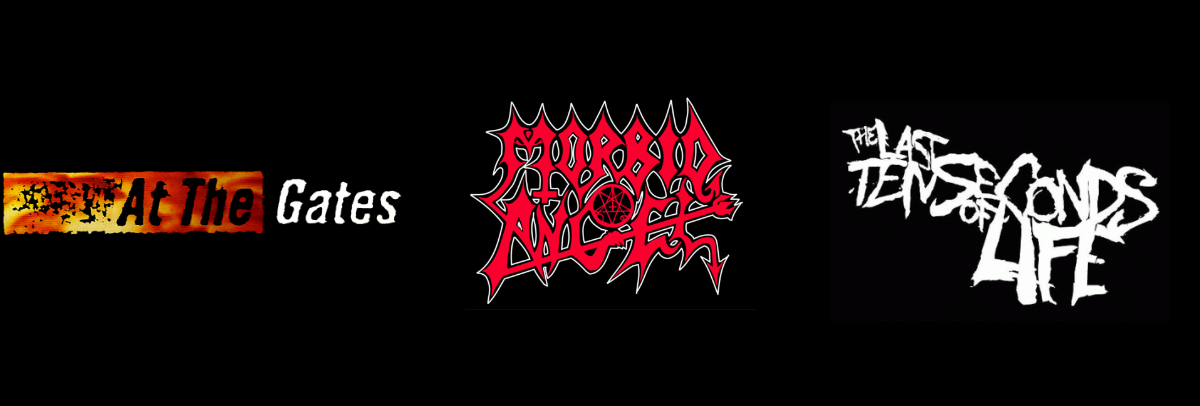
DEVIATION
To which degree does the lettering deviate from the baseline, i.e., the invisible line upon which a line of text rests?
Low: the letters of the band name are all positioned on the same line (At the Gates); medium: there is some deviation from the baseline (Morbid Angel); high: the letter position varies a lot (The Last Ten Seconds Of Life).
Additional Graphics
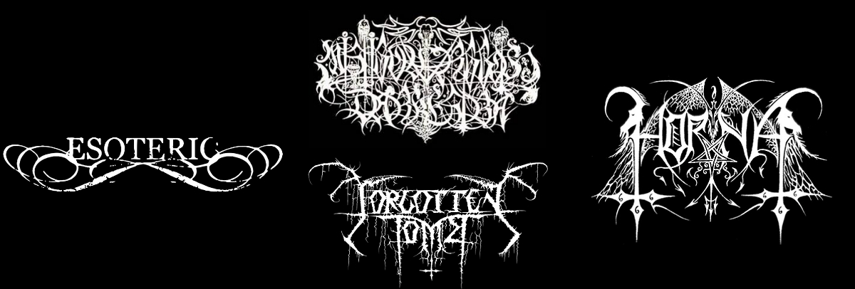
CONGRUENCE
How congruent and ‘meaningful’ are the graphical elements with respect to the band name or genre?
Low: they are purely “meaningless” decorative (e.g. swirls and curls) (Esoteric); medium: the logo features both “meaningful” and “meaningless” graphical elements: either because the logo represents a mishmash of information (Mistigo Varggoth Darkestra) or because the band changed genre or style (Forgotten Tomb); high: they are meaningful graphics related to the metal genre or band name (Horna).
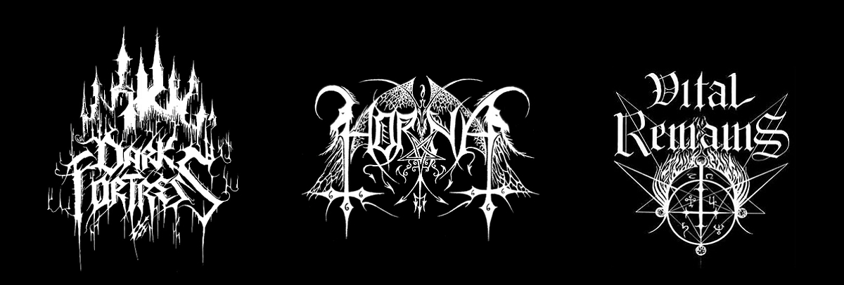
ABSTRACTION
How abstract are the additional graphical elements?
Low: the logo contains only “meaningful” figurative images, e.g., trees, goats, dragons, pagodas (Dark Fortress); medium: the logo contains a combination of both figurative and symbolic graphics (Horna); high: the logo contains only abstract symbols, e.g., pentagram (Vital Remains).
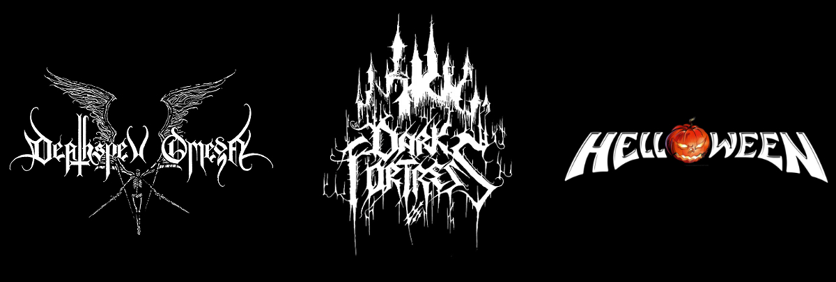
INTEGRITY
How well are the graphical elements integrated into the logo?
Low: they are in the background (usually darkened, or at low opacity) (Deathspell Omega); medium: they are a strong part of the logo, but still somewhat separate (Dark Fortress); high: they are an integral part of the logo and lettering (Helloween).